Thinking of using images in your thesis? Good idea. And easy to do with everything now being digital.
I love an image. I enjoy a photograph. I like a good diagram. I’m happy pouring over a graph or table. But not always. And I’m not alone.
Key thesis readers, the examiners, are not always thrilled when graphics appear in a thesis. They are less than pleased when thesis illustrations, as they are sometimes called, are poorly judged additions.
Here’s some examples of thesis images that don’t work:
- the photo is pretty but adds nothing. The reader could get what they need to know just from text. The examiner wonders if the image is there simply to make the page look better, or perhaps has been inserted in the mistaken notion that the image adds some kind of veracity to the words.
- the photo contains lots of clues for analysis but these are not taken up in the accompanying writing. The analysis of data proceeds as if the image is a window on reality but not worthy of critical attention. The examiner wonders how they are meant to interpret the visual.
- photos, tables, graphs and diagrams are used to support minor planks in the argument. But why? The reader notices images. Making an image suggests that space has been given over to the image because the point it makes or supports – it illustrates – is significant for the argument. The examiner can’t make sense of a visual supporting a relatively slight point when what seem to be key questions go unaccompanied.
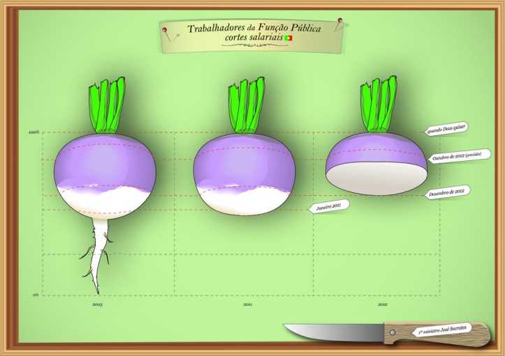
- the diagram, table or graph does not make sense. While a diagram, table or graph should always be contextualised in a thesis text, (the convention is: figure 1 shows, table 2 demonstrates… ) it should also be its own little self-contained nugget of information. The image that accompanies this text for example can be read and partially understood just as it is. But it would benefit from some further analysis… and an associated point,
- the diagram is free-floating. The words don’t show what point the diagram will amplify or explain. The examiner wonders what it’s about. Unlike the image that accompanies this blog post, thesis images always need to be anchored in the sea of words. Having the examiner search for the connection isn’t good.
- the diagram is so complicated it takes the reader a long time to work out what it means. It obviously meant a lot to the researcher who made it, but it’s not obvious to anyone else. The examiner is mystified. That’s probably because
- the diagram is poorly designed. There are too many labels. The examiner doesn’t understand what the labels refer to as they bear little relationship to what’s going on with the text. The arrows that are mean to show relationships are a thick tangle and the reader can’t work out which relationships are most important and which less so. Or maybe…
- the diagram is so idiosyncratic that it takes the researcher two pages of words to explain. If it’s that individual, then the diagram isn’t doing its job. The examiner ought to be able to follow a diagram with minimal additional support.
- the principles underpinning the use of shapes is unclear – the circles and boxes in the diagram seem to refer to incommensurable things. The examiner can’t figure out what design principles guided the development of the image.
- the caption doesn’t summarise the major point that the examiner is to take from the image, diagram, table or graph. A good caption captures context and the key message the examiner is to remember.
- the table or graph is too detailed. A table or graph isn’t an exhaustive display of every single bit of data possible. It is a careful selection which makes a key point. Lengthy and detailed information, say systematic recordings of an event or experiment, need to go into the Appendix where the examiner-reader can get at them. An examiner doesn’t want to be made to stop reading to check and/or make sense of loads of detail mid chapter – they like to choose when and how to pursue the micro information.
- a table, with its patterns and rows of numbers, is used to show a trend, rather than a graph – the examiner quickly sees a trend from a graphic line.
- the images are dodgy. Low grade clip art is used to create poor quality images and diagrams. The photographs are grainy and poorly cropped. The examiner is left wondering why the writer used such amateurish material in their thesis. What did they think their examiner would conclude from a poor choice of image?
So that’s a list of image glitches to avoid.
The good news is of course that if you avoid these mistakes, a well chosen and produced image, graph, table or diagram can be a very helpful aide to the examiner.
Some of this material is adapted from Evans, Gruba and Zobel (2011) How to write a better thesis. Pp 154-160.
Image credit: Pedro Brito, Flickr Commons

Thanks
LikeLike